


Do you like lettering and have you tried to do it but it doesn't look like the pictures? Don't worry, today we'll teach you some simple tips for lettering that will make your letters look like those of experts.
What is lettering?
First, if we want to practice an art, it's important to know what it is. Lettering can be defined as the art of drawing letters. Many people confuse it with calligraphy, but there's a big difference; in calligraphy, you can't lift the pen at any time, while in lettering you can lift it as many times as you want.
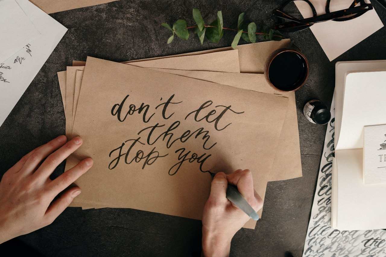
Simple tips for lettering
If you've recently started lettering, today we bring you some tips that will help you improve your technique in the art of drawing letters.
1. Before writing, do exercises to loosen your hand
That's right, before you start drawing, grab a pencil and paper and start making fluid strokes to loosen your hand so that when you make the letters, your hand is used to the movement.
You can make waves along the page, spirals, circles, mountains, or circular shapes, as lettering tends to have very rounded letters.

2. Use the right markers
For lettering, there are special markers known as brush tip markers. These allow you to change the thickness of the stroke with the pressure exerted by your hand, which is the basis for lettering.
However, there is something called false lettering, which is when markers that don't allow us to change the stroke size are used, like Sharpie markers. In this case, a double trace is simply made so that one is thicker than the other and appears to have been done with a brush tip.
If you don't know which markers to buy, here's a guide.
3. Lift your elbow off the table
This tip seems simple but believe us, it will make a difference. Lettering is a very fluid art; the letters have many curves and rounded lines, so it is important that the strokes look natural and lifting your elbow off the table will allow movements to be fluid and not break in the middle of a stroke where you cannot lift the marker.
4. Upstrokes are thin, downstrokes are thick
We present the golden rule of lettering: if you learn this, you already know how to do lettering. Every time the stroke direction is from top to bottom, pressure is applied to the marker so that the stroke is thick, and when it is from bottom to top, minimal pressure is applied so that the stroke is thin.
What you should practice is making both strokes (thick and thin) in a single movement without a noticeable difference. For this, we recommend doing many exercises making shapes such as circles, zigzags, mountains, or semicircles.

5. Marker posture
The correct way to hold the marker is fundamental for creating the double stroke. It should always be tilted; you shouldn't change the angle at any time because what makes the thickness change is the force you apply to the marker, not the angle. If the marker is placed straight, the tip can be damaged.
6. Consider the composition of each letter
Each letter is a composition of different shapes, for example, 'a' is the sum of a circle and a line, 'm' is the sum of a line and two mountains. If you break down each letter and consider each shape when drawing, your lettering will reach an expert level.
Materials needed to start lettering
To create quality lettering, it's important to have the right materials that allow you to express your ideas with precision and style. Let's explore some of the essential materials to implement these lettering tips and improve your skills in this creative discipline.
1. Flexible-tip markers
They are essential tools for lettering. These markers have a tip that flexes according to the pressure applied, allowing you to create thick and thin strokes with ease. Additionally, they come in a variety of vibrant colors that allow you to experiment with different styles and effects.
2. Quality paper
The fine papers from Medellín are a fundamental part of the learning process. It's important to choose quality paper that is resistant and has a suitable texture for practicing the lettering tips. Watercolor paper or drawing paper are excellent options, as they allow ink to absorb evenly and facilitate the creation of smooth, defined strokes.
3. Ruler and templates
For those starting in the lettering writing technique, rulers and templates can be useful tools to help maintain consistency and precision in strokes. Rulers are useful for creating straight lines and guiding the height and width of letters, while templates offer a variety of shapes and styles that can be used as reference or to add decorative details to your designs.
4. Watercolors
Watercolors are an excellent option to add color and life to your designs created with the lettering tips. With a varied color palette, you can mix and match tones to create stunning effects and add depth to your letters. Additionally, watercolors offer the flexibility to work with layers and shading, allowing you to experiment with different styles and textures in your creations.
5. Lettering brushes
Lettering brushes are specialized tools designed specifically for this discipline. These brushes have soft, flexible bristles that allow for smooth and precise strokes with ease. Additionally, they come in a variety of sizes and shapes, allowing you to experiment with different styles and effects in your lettering designs.
At Panafargo, you'll find everything you need for lettering
Now that you know the lettering tips and main materials, at Panafargo you can purchase these and many more items for art, crafts, and general stationery.